
April Yang
I am a UX designer who innovate and inspire

Subway
Make your order fun, fast and accurate
This project is a co-creation between Subway and Visa Innovation team. This project spanned 3 months and covered the whole design process from user research to prototype and launch. Our goal is to help Subway reduce their check out time in stores. We conducted user interviews to find out what's causing the problem, brainstormed and iterated our ideas to solve the challenges. Eventually Subway launched our design in their app, making millions of customers' ordering experience much faster and accurate.
My Role: UX Designer | UX Researcher | UI Designer
Process: Research | Analysis | Ideation | Prototyping
Tools: Illustrator | Photoshop | Sketch | InVision
I embraced the design thinking methodology to approach the challenge. I believe designers are the bridges connecting people, technology, and business to enable creating solutions and impact how the world works.
Design Thinking Approach

Design Thinking
This project enabled me to look at my design skills from a different perspective. In my opinion, design is not just an artistic practice and creativity is not just a person's inspirational expression. I think about how to connect people, business, and technology in a way that would amplify the power each of the party possesses. As a designer, I use my creativity coupled with methodic thinking to come up with solutions that can address problems in the real world. I then bring the ideas to life by leveraging my skill of testing and prototyping to make sure that the solution is what people truly need.
The Challenge
I believe in order to solve the right problem, we have to observe and conduct the research at the place where we’ll be designing our solutions for. So we went to the Subway stores and took a deep dive into the consumer experiences. We also did Guerrilla observations and interviews with the Subway customers and staff in Miami.


We found that on average, a consumer would spend 90 seconds waiting in line, before spending another 60 seconds ordering her sandwich. During peak hours such as lunchtime, the line would be so long for some customers that they would just give up and go somewhere else for lunch, representing a business problem for Subway.
To make it worse, a customer might assume that the store is always going to be that busy in peak hours so she would never come in again during that time.
We also found in our research that most of the customers like the interactive ordering experience, and being able to control the parameters of the ingredients (the kind, amount, etc.). However it is the indecisiveness that creates the line which in turn slows down the whole process.
Considering the business (driving sales and help develop loyalty of the customers) aspect and people (making their ordering experience faster and smooth), we decided to focus on solving the queuing problem as the goal of this project.
Customer & Staff Interviews
We conducted user interviews to learn about customers' behaviors and their experiences visiting Subway and ordering their meals. We sat down with 10 customers and 3 staff in Miami and San Francisco. We took extensive notes and later on convert them into empathy maps to synthesize/consolidate our research and come up with insights and opportunity area.

"I usually get the same thing every time or just alternate between two items depends on how healthy I need to be."

"Waiting in line is frustrating, because you don't know how long the people in front of you are going to take."

"It would be great and faster if they can remember my favorites and how I like my sandwich done."


"Repeat clients are the easiest. Smoother process and conversations."
"People's indecisiveness and uncertainty creates the line."
"Order ahead is a huge fraud problem. Chargebacks and food wasted."


One of the most important findings we discovered based on our research is that the customer would spend a considerable amount of time waiting in the line before she gets to order her sandwich. The business also loses sales when customers see the line outside and decided to go somewhere else to get their sandwiches. This is because the customer often goes to Subway when he/she needs a quick meal and
doesn't have time to hang around. This insight helped orient our solution in designing something that can help remove the line in the stores.
In our interviews with Subway customers, we found that most of the customers order the same stuff every time they visit the store, or just alternate between two or three things on the menu. One of the customers told us that he wishes the sandwich artist could remember his order since it would make the whole experience faster and delightful.
During our interviews with Subway staff, we found that ordering ahead has been creating fraud problems for the business. Because of the chargebacks that the store has to bear, the food already used and the 12% royalty fee paid using the order ahead service, the store managers have been up in arms about this service.
A staff told us that repeating customer is the easiest because she know how the customer wants her sandwich done and can move on to getting it done efficiently. This is interesting because we know that the sandwich artist is the only person who knows/remembers the customer's preference. What if she leaves the job or is not working on that day when the customer visit? One of the reasons that people like Subway is because of the consistency it provides. This insight helped us think about how to provide customized services that keep track of customer's preferences at the same time make sure we have a consistent experience between stores.
With these insights we gathered after talking to the staff and the customers, we can start to brainstorm with informed design solutions that tailored to the real needs of both sides.
Brainstorming
We brainstormed with the Subway team and generated many ideas that have the potential of solving the problems for both the store and the consumer while boosting the sales. We generated more than 50 ideas during the session. We also leveraged our collective wisdom by bringing in a multidisciplinary team in the room and bringing many different voices to the table.


Part of the benefit of an ideation workshop is bouncing off ideas of other people and build on the ones that work. So we took advantage of the cross-functional team and encourage everyone to build their ideas upon each other's. We clustered the ideas and rated them based on their relevance and feasibility using a metric grid. Among all the ideas, the most promising ones include interactive ordering experience, ring up in-line, self-checkout, and grab-n-go experience.
After several rounds of bouncing ideas off of each other, we combined several ideas and created a new end-to-end ordering experience that shortens the line and the wait time, while keeping the interactive ordering part in the experience.
After the workshop I reflected on how we can improve next time. One thing I found is that there were no physical stimuli/provocations in the room. We used stimuli that we found online, printed them out, and put them up on foam board. Next time I would like to try having both digital and physical stimuli in the room. For example, since we're reimagining the ordering experience, we can bring in exotic menus from restaurants all over the world, as well as old menus from the last century (if possible). I believe it would further stimulate the flow of creative juice in everyone's brain and generate more out-of-box ideas.
Storyboard
I made a storyboard to illustrate the use case for the our design. The storyboard also helps the workshop participants to communicate the idea to their stakeholders when they need to get buy-in from them.
I made a storyboard to illustrate the use case for our solution. The storyboard also helped everyone in the team to communicate the idea to their stakeholders when they need to get buy-in from them.

1. John, a 35-year-old doctor, usually only has 30 minutes for lunch. He goes to Subway often because he wants to be sure of a fast and accurate order, and the ability to see his lunch being made for reassurance.

2. John goes to Subway one day for a quick bite. Walking into the store, John sees Subway's new order wall and decides to try it out.

3. Walking up to the wall, it recognizes him and suggests John his favorites, sub of the day and seasonal sandwiches.

4. He picks one and customizes it quickly, pulling out a couple of ingredients and adding others, noticing locally sourced ingredients and healthy options.

5. Satisfied with his customization, he pays with his card on file. Soon he sees his name appear on status board saying “Tiffany is making your sandwich“.

6. He steps over to the counter and talks to Tiffany while she is putting his sandwich together. While he enjoys watching his sandwich being made, he also asks for a little extra sauce at one point.

7. When Tiffany is done making John’s sandwich, she puts the order in a bag, and put it in John’s assigned cubby. John then grabs his order out of the cubby swiftly and walks out of the store.

8. A little later, the Subway app notifies John that he has earned another Subway loyalty point, and that he is only one point away from getting a free cookie. He plans to go back the next day to enjoy the whole experience again.
We illustrated this happy path scenario that would also depend on the capacity of the technology we are going to leverage. For example, we'd love to build our solution on the walls in order to save some space. The ideal scenario for a user would be he walks up to the wall and the screen would recognize him using facial recognition technology (in a not creepy way that has been validated).
It's also good to have a plan B for the dependencies since we know we'd be building a MVP. For instance, we decided to build the experience on a kiosk after knowing building on the store wall probably would not work for the first phase. Instead of recognizing the customer using facial recognition tech, we use customer's credit card or loyalty card to bring up his/her profile and provide personalized service.
Low-Fidelity Prototype
We build several prototypes to test out the concept. We started from low-fidelity prototype where we use cardboards and paper to build the cubby, the kiosk and the ingredients. We invited our fellow designers and people from other teams to go through the experience and give us honest feedback to help us improve the experience.


We built our first design using cardboard and paper because it’s cheap if we need to change anything. It also allowed us to quickly tweak different interactions on the spot when the participants give us feedback. Being low-fidelity gives a feeling of incompleteness so people would focus on the experience instead of giving feedback about things that are too granular at that phase. We tested our lo-fi prototype with 15 people from our office with different tech-savviness and level of familiarity with Subway.
We asked each participant to give us honest feedback to help us improve the experience. We captured their feedback using four quadrants: things you like the most (Like), things that could be improved (Dislike), things that I don’t understand (Questions), new ideas to consider (Ideas).
We found that people are concerned that someone else would steal their orders. We also found that
even though we showed people the cubby number of their orders, they couldn’t remember the number when they were standing in front of the cubby. To solve these problems, we decided to have customers scan their receipts (on phone or paper) to pick up their orders.
When the customer scans the QR code on the receipt, the designated cubby would light up and the door
would pop up automatically for the customers. This would take off any mental burden that the customer has due to remembering the right cubby number (recognition instead of recall).
If Subway has more budget to spend on the cubby, the best way would be to show the customer’s name on the cubby door and have it light up when the order is ready.
From our testing, we found that the status of their orders was not clear for the customers. So we decided to put up some status boards to make the process transparent.
We found that since most of the users are right-handed, it makes more sense to place the ingredients and other functions that require more interactions on the right side of the screen. In the future, we plan to
have customized settings in regards to where everything on the screen is being placed to make it friendly for people with disabilities and people who are taller/shorter than average.
The feedback we got also taught us that people prefer to drag and drop while customizing their own ingredients, as it simulates the interaction of putting ingredients into a sandwich in the real world.
We ran into some challenges when we tested our lo-fi prototype in the office. For example, our biggest meeting room was not even as big as the smallest Subway store. In order to get the closest resemblance, we decided to leverage our existing team space and turned our shared space into the testing zone. We coordinated with the office facility staff to make sure we can leave our cardboard prototype and not affect other people’s work. We also talked to people who sit in the area that we are conducting a prototype test here so they understand that there might be more foot traffics than usual.
Store Constructions
To make the whole experience feel real for the Subway CEO, we decided to turn the presentation room into a subway store. This is the first time that we do a design like this and everyone involved was very excited. In order to make this happen, we need to build the floorplans and work with several vendors to build the kiosk, the cubby, the sandwich counter, while making the prototype on a 52-inch screen.


We came up with two different arrangements for the stores depends on the constraints of different store locations (For example, the store size would be smaller in the metropolitan area).
The whole concept is to make sure that the first thing a customer sees while stepping in the store is the kiosk for them to place an order. The image on the right is the ideal layout for a store if it has enough space and the ideal entrance location.


We worked with a carpenter to build our customized kiosk for people to place their orders. Besides working with the carpenter on picking the right color and finish, we also need to decide the height for the POS terminal to sit, and how the wires are organized in the back so that the engineers can do their job in the most efficient way, etc.
High-Fidelity Prototype
We built a high-fidelity prototype using a 52-inch touch screen. We tested the interactions and the flow to make sure that we are enabling a smooth experience for our users.


We started with a dark background and then quickly realized that the food does not look so good there. So we switched to a light background and then boom, everything just pops out beautifully. Since we’re designing for a food company, whether the food looks appealing or not matters a lot to the experience.
What I learned here is that a certain design/background might look great when you design and see it on your computer screen, but it might not look so good when you put them on the screen size they need to be. In this case, the dark background design looks fine on my computer but failed to deliver the enticing atmosphere when being put on the 52-inch screen.
Final Design & Demo
We successfully turned the presentation room into a Subway store and presented our solution to Subway’s CEO. She was very pleased with the design solution and delegated a team to take this project forward. Subway took the result of this collaboration and launched a new app that incorporated our design.


ROTATING HOMESCREEN
The design of the home screen was meant to give the customer a sense of fresh food with healthy vegetables. We wanted the customer to see the ordering kiosk when they first enter the store. So we decided to use rotating background images with a decent amount of contrast to grab the customer’s attention.
The height of the arrow aligns with the height of the arm of an average customer, so the main action to start ordering is obvious to the user. The reason that the customer needs to insert the card is for Subway to customize the experience for her, such as bringing up the last order or the favorite item.


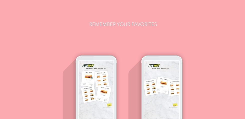
CUSTOMIZED ORDERING EXPERIENCE
Since most customers who visit Subway are in a rush or just want a quick meal, the first thing a customer sees is the last order and Sub of the day. Based on our research, most customers order the same item every time they visit the store. So the fast-track option is very valuable as it saves a lot of time.
We use the card format instead of the traditional list design to make the experience more visual and engaging. The loyalty card down the right side shows how far a customer is from getting a free sub, we learned that this is the most important information a customer wants to know regarding her profile. In light of this, we decided to make it visible upon login, so she doesn’t have to dig into her account details.


FUN INTERACTIONS
The customization experience is the most fun part which is playful and efficient so the store can speed up the orders. When adding an ingredient, the customer can either drag and drop or just tap on the item if she’s in a rush.
In the traditional ordering experience, the process has to be linear, which is limiting for the customer. What if a customer wants to customize her sauce first before picking the bread? The kiosk would be a perfect place for that! To avoid unnecessary confusion, we decided to use real food pictures instead of icons to present the ingredients. When a customer wants to remove an ingredient (say, the tomato), he can either swipe the tomato away or just tap on the remove button on it.


CLEAR INSTRUCTIONS & SUMMARY
After the customer reviews and places their order, she sees a clear instruction on what’s happening next. Currently the wait time is boring and people are always on their phones. There’s no interactions with the sandwich artist and thus no connections are made.
Research has shown that a customer would be more willing to go back to a store if she knows the staff there. So we added a personal story about each sandwich artist and spiced it up with some fun facts about him/her. By doing this, the customer not only knows something about the person who’s making her sandwich, but she can start a conversation with the sandwich artist if she wants. We believe this final touch would keep the customer engaged throughout the whole experience.


Using the kiosk would take less than 25 seconds if the customer is ordering the same things as the last order, compared to the current 60 seconds where the customer points at the ingredients he wants. What's more, we use card-on-file so the customer doesn't have to fumble his wallet for a card to pay, which makes the experience frictionless.
Currently, the sandwich artist has to stand there and wait for the indecisive customer to make his decision, which creates the line. With the implementation of kiosks, the sandwich artist will be constantly making subs which means her workflow will become more efficient since no more time will be spent due to customers' indecisiveness.
The plan is to put at least two kiosks in each store, depending on the size. By doing this, we can significantly improve the queue problem. Compared to the current situation where the customer only has one touchpoint (a single line) to order their sandwich, they will have at least three (two kiosks plus one sandwich artist) using our design.
This is just the MVP and due to time and resource constraints, we didn’t get a chance to do more iterations on the prototype. There are definitely areas for improvement in the future. For example, there should be a way to change meat in the middle of the customization (customers decide the meat when they select the sandwich to customize, but they have to go through the customization again if they decide to change meat in the middle of the experience).
Subway took our concepts and implemented them in their mobile app. Below is the current subway app design at the time of writing, with 4.8 stars after 255k user ratings.
SUBWAY CURRENT APP DESIGN WITH OUR CONCEPT IMPLEMENTED


